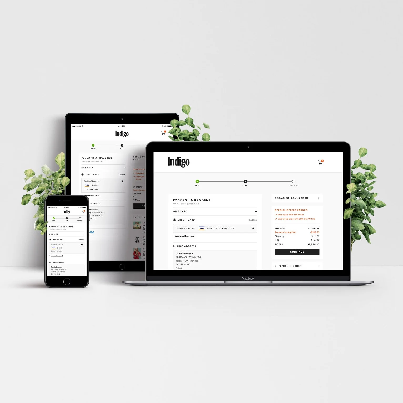
Indigo’s Checkout Redesign
Our team at Indigo Digital recognized the need to update the styling and improve our experience as a customer goes through checkout. A year and a half before starting this initiative, Indigo had undergone a complete website redesign to make the site responsive. Checkout was not part of this project and the experience was jarring for our customers. We recognized this as a huge opportunity and make the checkout process as seamless and as easy as possible for our customers. We were working mobile first within an agile product development cycle and the project ran over the course of 9 months, with iterations continuously being made to this day.
Company: Indigo Role: Product Design Lead Project Length: 10 months Outcome: 1,800-2,000 bps lift ($250k of revenue per week or $13 million/year)
Problem
The checkout a crucial part of the purchase path where customer support got the most calls and where customers experienced the most confusion, stress and anxiety. The flow was not intuitive, brought customers a lot of error states, where the most drop-offs were seen.
Old checkout
Competitive Analysis
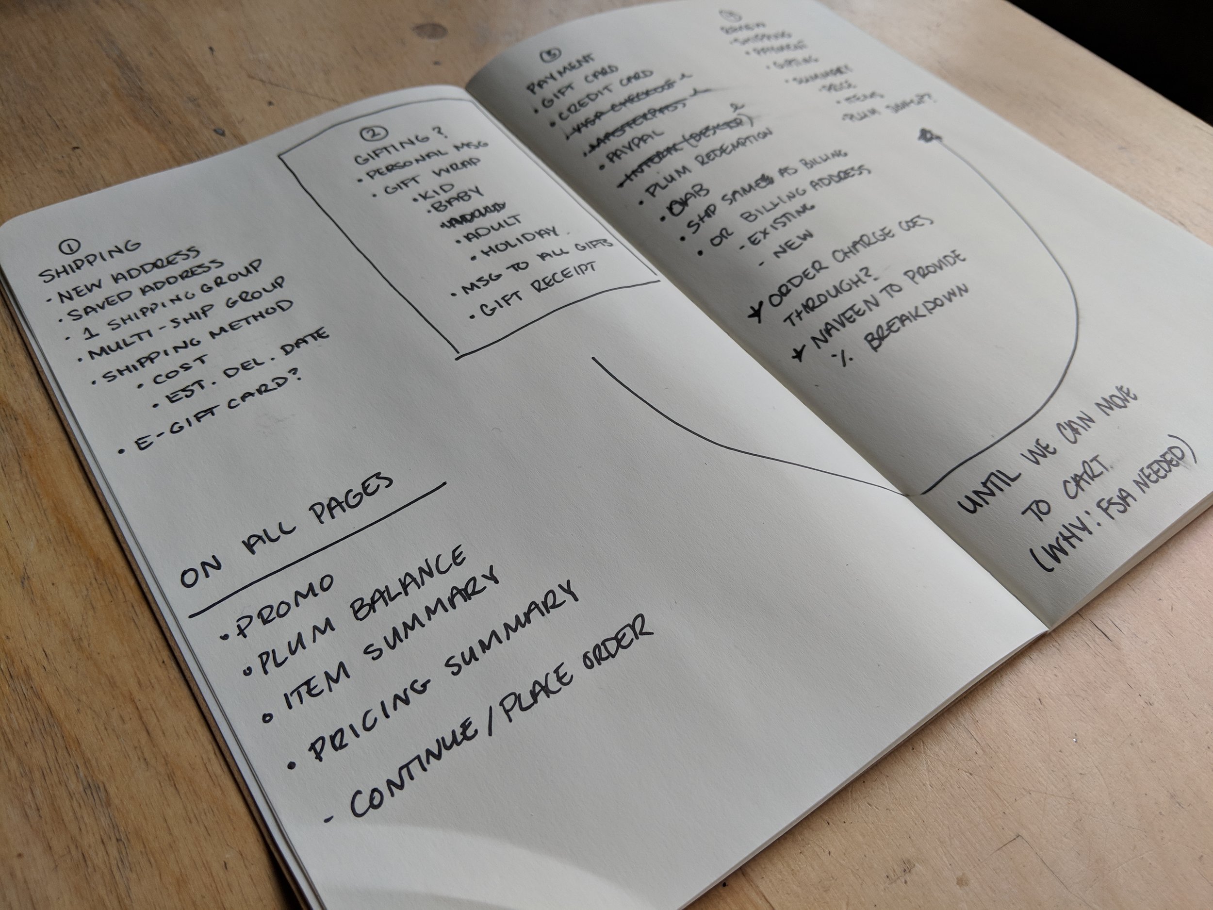
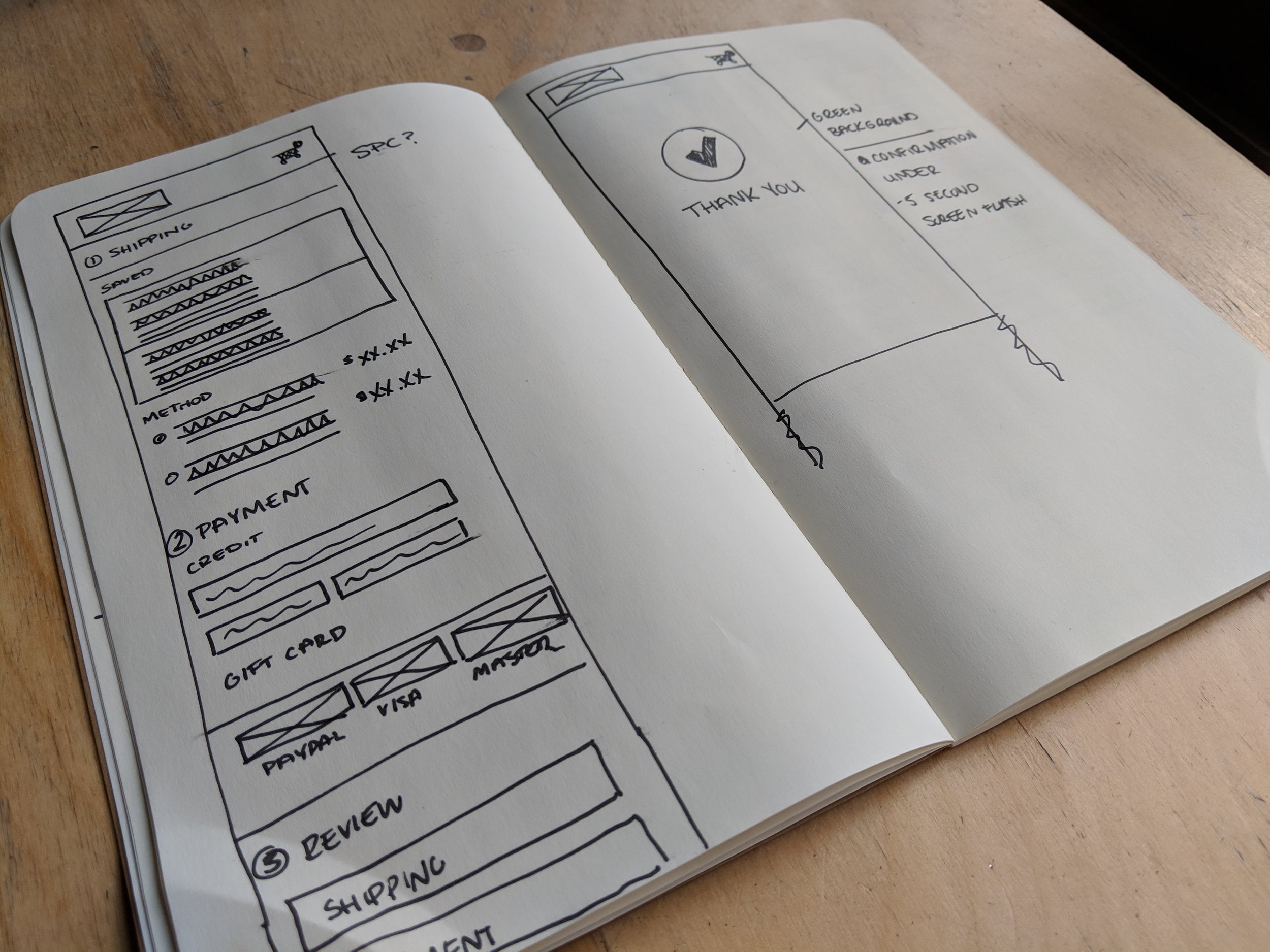
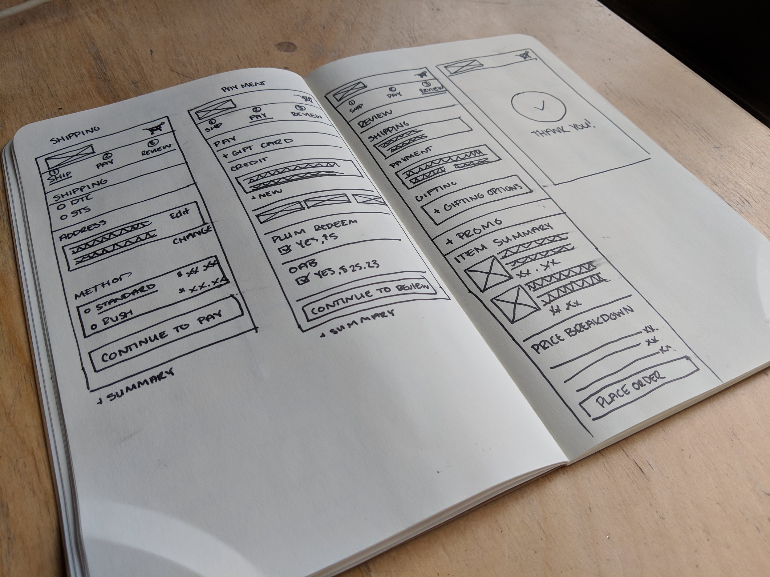
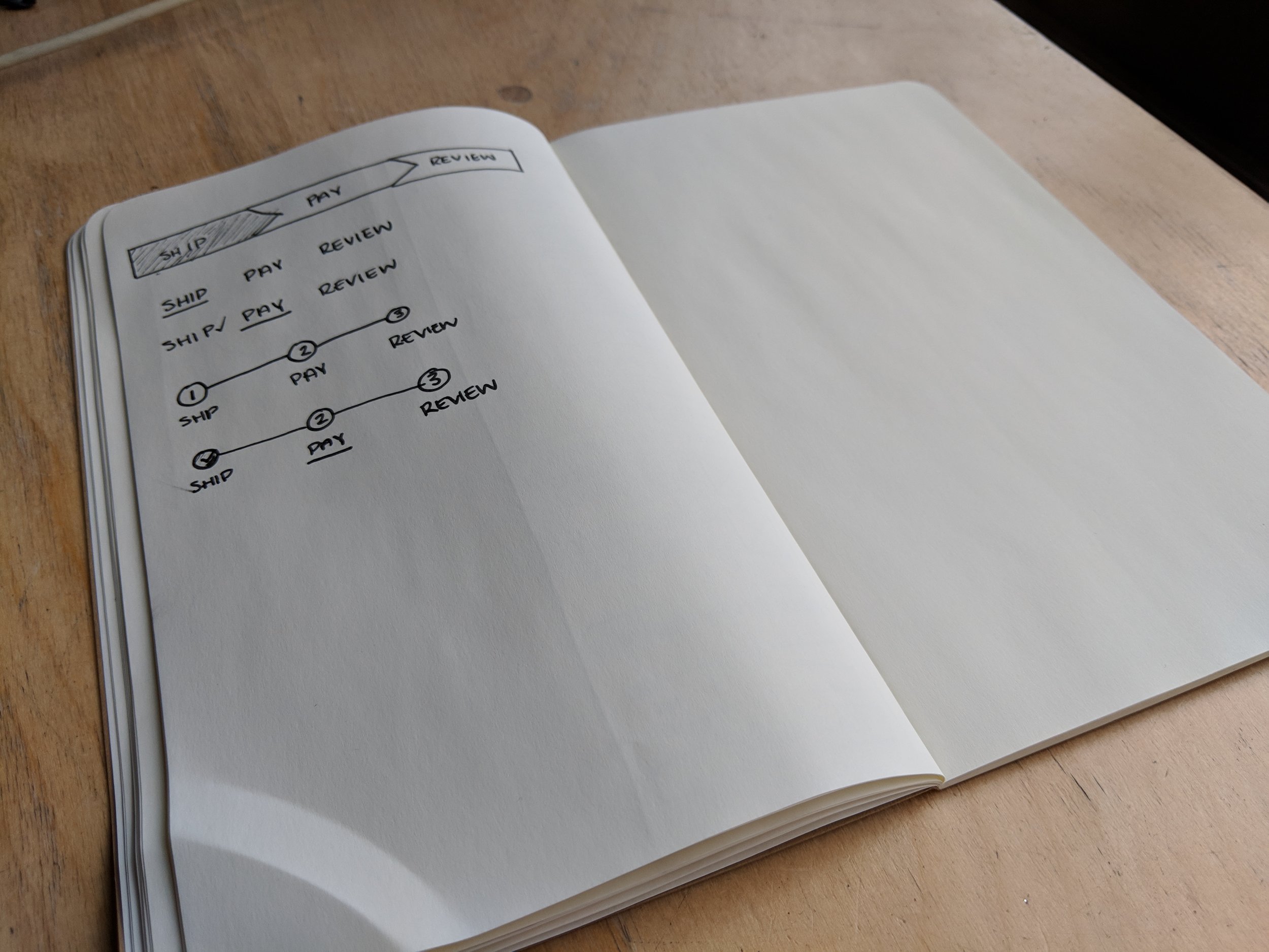
This project started fast and furious, which meant we had to be scrappy when it came to research. I read through a Baymard and NNG research report on checkout experiences, went through analytics in our old Single Page Checkout (SPC), combed through customer feedback from OpinionLab and our Customer service team to develop some initial ideas and assumptions. From here I put together high-level wireframes of the structure of our new checkout, ultimately deciding on a multi-step experience. Indigo’s checkout is very complex. For example, we split shipping groups, have many different shipping methods (lettermail, rush, priority, eGift Card, etc.), some products don’t qualify for international shipping, we accept many forms of payment (gift cards, Visa Checkout, Masterpass, PayPal, Interac, Online Account Balance, Plum Rewards, etc. to name a few! This multi-step approach would help keep the customers focus to the task at hand, while make it easy to guide them through the rest of the flow.
Process Approach
Since we were working in sprint cycles, parts of the project were prioritized in a roadmap of what we were tackling first. I started with Sprint 0 (which lasted about 5-6 weeks) where I sketched out the flow for checkout and then deep-dived into each panel (shipping, payment and review) to wireframe a rough idea of the elements on that page and how I thought it could be laid out. I took these wireframes to internal stakeholders and customers to get a sense of how they felt about this approach. I would spend the early part of the sprint wireframing a feature, collaborating with the development to get an idea of technical constraints and considerations, and sending some wireframes out to customers whenever A/B tests were needed. After input was given from customers, I would begin mocking up designs.
Impact
Upon completely our guest checkout, we launched as a pilot to get some early feedback on how it’s performing. Right off the bat, new checkout was performing exceeding well. Better than anyone expected. We noticed a couple issues customers were having early on, such as auto-fill not working on the province field, and corrected it right away which resulted in less customers getting an error. After we fully rolled out the new checkout experience, we calculated a 1,800-2,000 bps lift, resulting in an additional $250k of revenue per week ($13 million/year).
